What do you want to create today?

Params
12 Credits

Popular categories

Try one

Trending videos

See what creators are making with AI video.

Explore creations

Discover AI-generated images from the community.

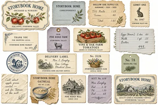
Create a varied collection of 14–18 separate Storybook Home ephemera pieces on a clean natural-white background.

These are small surviving paper things gathered over time from the businesses, farms, gardens, households, markets, and everyday life of Storybook Valley. They should feel like original found artifacts rather than newly designed vintage-style printables.

The purpose of this collection is to visually bridge the full watercolor world of Storybook Home with its commercial printing, handwritten records, rural packaging, domestic papers, and everyday ephemera.

Treat the entire sheet as a curated visual collection, not a catalog of matching label templates. Exercise independent design judgment.

Invent each piece according to its own imagined purpose. Allow substantial differences in size, proportion, shape, visual weight, color, typography, illustration, and empty space. Let the content determine the form rather than placing different designs inside predetermined tag shapes.

Include a natural mixture of found paper things: illustrated labels and tags, small trade or correspondence cards, merchant marks and seals, tickets, packaging remnants, produce or farm labels, small receipts or account fragments, handwritten notes, numbered slips, advertising pieces, and a few ambiguous little scraps whose original purpose is not completely explained.

Do not make every artifact equally elaborate or informative. Some pieces may contain only a number, small image, merchant mark, handwritten notation, or fragment of printing. Others may be more complete.

VISUAL RHYTHM

Compose the collection for visual rhythm across the entire sheet.

Create a few larger dominant pieces, several medium pieces, and a scattering of smaller incidental pieces. Balance richly illustrated objects against very quiet ones.

Allow some artifacts to contain generous blank paper. A small correspondence label might contain one botanical corner and a blank writing line. A numbered ticket might contain little more than an image and number. A merchant seal may be purely graphic. A receipt may contain considerably more information.

Avoid making every piece approximately equal in visual importance.

Avoid repeating one label architecture, border style, tag silhouette, or decorative formula throughout the collection.

BRIDGE BETWEEN ART AND PRINT

Allow different visual languages to coexist naturally.

Some pieces may contain small transparent Storybook Home watercolor illustrations: fruit branches, oak sprigs, flowers, birds, baskets, produce crates, watering cans, farm buildings, rural landscapes, orchard rows, animals, or other appropriate Storybook Valley subjects.

Other pieces may use fine monochrome or single-ink commercial illustration, resembling restrained early-twentieth-century engraved or pen-and-ink printing.

Some should be hybrids: a commercial label with a small watercolor branch; a monochrome merchant mark beside a softly painted landscape; a printed rule interrupted by watercolor foliage; a numbered ticket containing a small painted crate or rural object.

A few pieces should be dominated by typography, handwriting, rules, numbers, or open writing space with little or no illustration.

Do not put flowers or botanicals on everything.

COLOR

Coordinate the collection through a restrained Storybook Home palette rather than making all the pieces match.

Use natural white, quiet ivory and pale buff paper; dusty indigo and blue-gray; muted sage and olive-gray; soft fern; warm stone; weathered wood brown; restrained brick red; muted ochre; lavender-gray; graphite gray and charcoal.

Individual artifacts should generally use only the colors they naturally need.

Some may be monochrome dusty blue. Some may use charcoal printing only. Some may carry faded brick-red printing. Some may contain fuller transparent watercolor. Others may remain almost entirely neutral.

Allow color to recur irregularly across the whole collection so that the sheet feels visually balanced without appearing deliberately color-matched.

Avoid an overall yellow, beige, brown, golden, or sepia cast.

STORYBOOK VALLEY

Use entirely fictional Storybook Valley farms, growers, merchants, markets, nurseries, suppliers, household businesses, and community organizations.

Allow occasional names, marks, products, or locations to recur so that apparently unrelated pieces quietly reveal connections to the same community.

Use restrained period commercial typography, small capitals, serif lettering, numbers, prices, fine rules, merchant marks, practical handwritten entries, and simple ornaments where appropriate.

Keep text subordinate to the visual collection. Do not make every artifact explain itself completely.

HANDLED, WORKING PAPER

These are working paper objects that have had a life. They have been carried, folded, written upon, handled across counters, tucked into pockets, stored in drawers and boxes, pinned up, bundled with goods, or saved among household papers.

Preserve visible evidence of ordinary use.

Allow individual papers to be slightly wrinkled, softly buckled, creased, rubbed, scuffed, thumbed, and unevenly worn. Corners may be softened from handling, bent, rounded, slightly crushed, dog-eared, or occasionally missing a tiny piece.

Edges may be abraded, frayed, irregularly torn, lightly dirty, softened, or uneven.

Include localized handling grime and irregular discoloration where believable: faint gray-brown finger soil along an edge, dirt caught within a crease, a small smudge, an isolated stain, a pale water tide, a tiny ring or spot, or a rubbed patch where the paper was repeatedly handled.

Some artifacts may contain stray graphite, erased calculations, faint pencil marks, ink smudges, pressure marks, pinholes, staple marks, old fold lines, tiny punctures, or remnants of adhesive.

Let printed material wear with the paper. Portions of rules, lettering, numbers, illustrations, borders, and merchant marks may become rubbed lighter, broken, faded, slightly smudged, imperfectly transferred, or partially lost across folds and abrasions.

Give every artifact a different history.

One piece may be badly wrinkled but fairly clean. Another may have a folded corner and rubbed printing. Another may carry a small dirty fingerprint or water mark. A frequently handled ticket may be substantially battered, while a correspondence card stored in a drawer remains comparatively clean. A package label may show abrasion where it once rubbed against other goods.

Do not apply identical distress to every object.

Do not achieve age by covering everything with uniform brown staining, sepia tint, artificial grunge, heavy foxing, burned edges, or decorative tears.

The grit should arise from specific physical evidence of handling and use, not from a generic vintage texture overlay.

Papers should remain attractive and usable despite their imperfections.

HANDWRITING

Where handwritten commercial or practical entries appear, favor ordinary graphite pencil: soft gray, slightly variable pressure and density, practical everyday handwriting, occasional corrections or faint erased marks.

Do not make all handwriting elegant calligraphy or decorative script.

DECORATIVE RESTRAINT

Decoration should arise naturally from the individual artifact.

Some pieces may have a thin printed frame, fine rule, merchant medallion, tiny diamond or star mark, restrained botanical interruption, or simple corner ornament. Others should have no decorative border whatsoever.

Do not make every object an ornate framed label.

Allow occasional watercolor or botanical elements to cross or interrupt printed structures naturally. These small interactions help connect Storybook Home's watercolor world with its printed cultural world.

PRESENTATION

Present every piece straight-on, completely visible, separate, and easy to extract, while preserving its natural wrinkles, creases, buckling, battered edges, and imperfect paper surface.

Do not flatten away the evidence of use.

Leave generous clean space between pieces. Nothing overlaps or touches another artifact. Nothing is cropped by the canvas.

No tabletop scene, surrounding props, ribbons, clips, flowers, hands, dimensional mockup presentation, or dramatic cast shadows.

OVERALL CHARACTER

The finished sheet should feel like a box of interesting paper things saved from the same place over many years.

Some were saved because they were useful. Some because they were attractive. Some simply survived.

They should not look like a coordinated set of vintage scrapbook labels.

Let watercolor, line drawing, commercial printing, handwriting, typography, quiet blank paper, dirt, wrinkles, wear, and imperfect edges coexist naturally.

Create cohesion through shared Storybook Valley identity, compatible materials, recurring restrained colors, related artistic character, and quiet connections among the artifacts—not through identical shapes or matching decoration.

Preserve irregularity, surprise, tactile imperfection, and quiet grit.

Create a varied collection of 14–18 separate Storybook Home ephemera pieces on a clean natural-white background. These are small surviving paper things gathered over time from the businesses, farms, gardens, households, markets, and everyday life of Storybook Valley. They should feel like original found artifacts rather than newly designed vintage-style printables. The purpose of this collection is to visually bridge the full watercolor world of Storybook Home with its commercial printing, handwritten records, rural packaging, domestic papers, and everyday ephemera. Treat the entire sheet as a curated visual collection, not a catalog of matching label templates. Exercise independent design judgment. Invent each piece according to its own imagined purpose. Allow substantial differences in size, proportion, shape, visual weight, color, typography, illustration, and empty space. Let the content determine the form rather than placing different designs inside predetermined tag shapes. Include a natural mixture of found paper things: illustrated labels and tags, small trade or correspondence cards, merchant marks and seals, tickets, packaging remnants, produce or farm labels, small receipts or account fragments, handwritten notes, numbered slips, advertising pieces, and a few ambiguous little scraps whose original purpose is not completely explained. Do not make every artifact equally elaborate or informative. Some pieces may contain only a number, small image, merchant mark, handwritten notation, or fragment of printing. Others may be more complete. VISUAL RHYTHM Compose the collection for visual rhythm across the entire sheet. Create a few larger dominant pieces, several medium pieces, and a scattering of smaller incidental pieces. Balance richly illustrated objects against very quiet ones. Allow some artifacts to contain generous blank paper. A small correspondence label might contain one botanical corner and a blank writing line. A numbered ticket might contain little more than an image and number. A merchant seal may be purely graphic. A receipt may contain considerably more information. Avoid making every piece approximately equal in visual importance. Avoid repeating one label architecture, border style, tag silhouette, or decorative formula throughout the collection. BRIDGE BETWEEN ART AND PRINT Allow different visual languages to coexist naturally. Some pieces may contain small transparent Storybook Home watercolor illustrations: fruit branches, oak sprigs, flowers, birds, baskets, produce crates, watering cans, farm buildings, rural landscapes, orchard rows, animals, or other appropriate Storybook Valley subjects. Other pieces may use fine monochrome or single-ink commercial illustration, resembling restrained early-twentieth-century engraved or pen-and-ink printing. Some should be hybrids: a commercial label with a small watercolor branch; a monochrome merchant mark beside a softly painted landscape; a printed rule interrupted by watercolor foliage; a numbered ticket containing a small painted crate or rural object. A few pieces should be dominated by typography, handwriting, rules, numbers, or open writing space with little or no illustration. Do not put flowers or botanicals on everything. COLOR Coordinate the collection through a restrained Storybook Home palette rather than making all the pieces match. Use natural white, quiet ivory and pale buff paper; dusty indigo and blue-gray; muted sage and olive-gray; soft fern; warm stone; weathered wood brown; restrained brick red; muted ochre; lavender-gray; graphite gray and charcoal. Individual artifacts should generally use only the colors they naturally need. Some may be monochrome dusty blue. Some may use charcoal printing only. Some may carry faded brick-red printing. Some may contain fuller transparent watercolor. Others may remain almost entirely neutral. Allow color to recur irregularly across the whole collection so that the sheet feels visually balanced without appearing deliberately color-matched. Avoid an overall yellow, beige, brown, golden, or sepia cast. STORYBOOK VALLEY Use entirely fictional Storybook Valley farms, growers, merchants, markets, nurseries, suppliers, household businesses, and community organizations. Allow occasional names, marks, products, or locations to recur so that apparently unrelated pieces quietly reveal connections to the same community. Use restrained period commercial typography, small capitals, serif lettering, numbers, prices, fine rules, merchant marks, practical handwritten entries, and simple ornaments where appropriate. Keep text subordinate to the visual collection. Do not make every artifact explain itself completely. HANDLED, WORKING PAPER These are working paper objects that have had a life. They have been carried, folded, written upon, handled across counters, tucked into pockets, stored in drawers and boxes, pinned up, bundled with goods, or saved among household papers. Preserve visible evidence of ordinary use. Allow individual papers to be slightly wrinkled, softly buckled, creased, rubbed, scuffed, thumbed, and unevenly worn. Corners may be softened from handling, bent, rounded, slightly crushed, dog-eared, or occasionally missing a tiny piece. Edges may be abraded, frayed, irregularly torn, lightly dirty, softened, or uneven. Include localized handling grime and irregular discoloration where believable: faint gray-brown finger soil along an edge, dirt caught within a crease, a small smudge, an isolated stain, a pale water tide, a tiny ring or spot, or a rubbed patch where the paper was repeatedly handled. Some artifacts may contain stray graphite, erased calculations, faint pencil marks, ink smudges, pressure marks, pinholes, staple marks, old fold lines, tiny punctures, or remnants of adhesive. Let printed material wear with the paper. Portions of rules, lettering, numbers, illustrations, borders, and merchant marks may become rubbed lighter, broken, faded, slightly smudged, imperfectly transferred, or partially lost across folds and abrasions. Give every artifact a different history. One piece may be badly wrinkled but fairly clean. Another may have a folded corner and rubbed printing. Another may carry a small dirty fingerprint or water mark. A frequently handled ticket may be substantially battered, while a correspondence card stored in a drawer remains comparatively clean. A package label may show abrasion where it once rubbed against other goods. Do not apply identical distress to every object. Do not achieve age by covering everything with uniform brown staining, sepia tint, artificial grunge, heavy foxing, burned edges, or decorative tears. The grit should arise from specific physical evidence of handling and use, not from a generic vintage texture overlay. Papers should remain attractive and usable despite their imperfections. HANDWRITING Where handwritten commercial or practical entries appear, favor ordinary graphite pencil: soft gray, slightly variable pressure and density, practical everyday handwriting, occasional corrections or faint erased marks. Do not make all handwriting elegant calligraphy or decorative script. DECORATIVE RESTRAINT Decoration should arise naturally from the individual artifact. Some pieces may have a thin printed frame, fine rule, merchant medallion, tiny diamond or star mark, restrained botanical interruption, or simple corner ornament. Others should have no decorative border whatsoever. Do not make every object an ornate framed label. Allow occasional watercolor or botanical elements to cross or interrupt printed structures naturally. These small interactions help connect Storybook Home's watercolor world with its printed cultural world. PRESENTATION Present every piece straight-on, completely visible, separate, and easy to extract, while preserving its natural wrinkles, creases, buckling, battered edges, and imperfect paper surface. Do not flatten away the evidence of use. Leave generous clean space between pieces. Nothing overlaps or touches another artifact. Nothing is cropped by the canvas. No tabletop scene, surrounding props, ribbons, clips, flowers, hands, dimensional mockup presentation, or dramatic cast shadows. OVERALL CHARACTER The finished sheet should feel like a box of interesting paper things saved from the same place over many years. Some were saved because they were useful. Some because they were attractive. Some simply survived. They should not look like a coordinated set of vintage scrapbook labels. Let watercolor, line drawing, commercial printing, handwriting, typography, quiet blank paper, dirt, wrinkles, wear, and imperfect edges coexist naturally. Create cohesion through shared Storybook Valley identity, compatible materials, recurring restrained colors, related artistic character, and quiet connections among the artifacts—not through identical shapes or matching decoration. Preserve irregularity, surprise, tactile imperfection, and quiet grit.

grok-imagine-image-2.0Sep 9, 2026
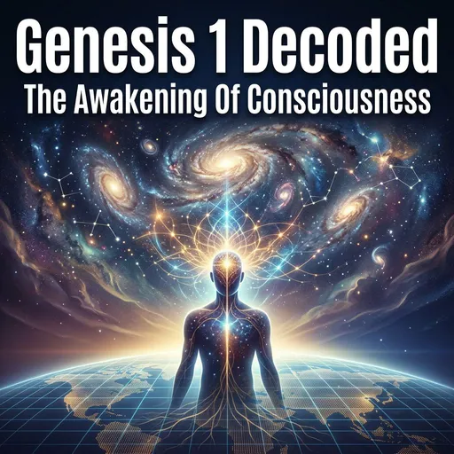
generate a professional looking thumbnail for Genesis 1, which is the awakening of source consciousness in human consciousness.

TITLE IN LARGE BOLD TEXT: Genesis 1 Decoded
SUBTITLE: The Awakening Of Consciousness

generate a professional looking thumbnail for Genesis 1, which is the awakening of source consciousness in human consciousness. TITLE IN LARGE BOLD TEXT: Genesis 1 Decoded SUBTITLE: The Awakening Of Consciousness

google/flash-image-3.1Sep 9, 2026
Nasty Jamz : https://youtu.be/aAAT3aqXUpo?is=L8oqkQ0XVVXDhFsC : "Sun in Gemini 13°01’ (House 6)
Moon in Virgo 5°52’ (House 9)
Mercury in Cancer 6°26’ (House 7)
Venus in Taurus 21°25’ (House 5)
Mars in Cancer 9°06’ (House 7)
Jupiter in Aries 21°24’ (House 4)
Saturn in Sagittarius 18°15’ ℞ (House 12)
Uranus in Sagittarius 25°14’ ℞ (House 1)
Neptune in Capricorn 7°16’ ℞ (House 1)
Pluto in Scorpio 7°39’ ℞ (House 11)
North Node in Aries 8°20’ (House 3)
South Node in Libra 8°20’ (House 9)
Chiron in Gemini 21°20’ (House 6)
Ascendant in Sagittarius 21°31’ (House 1)
Descendant in Gemini 21°31’ (House 7)
Midheaven in Libra 9°24’ (House 10)
Imum Coeli in Aries 9°24’ (House 4)"

Nasty Jamz : https://youtu.be/aAAT3aqXUpo?is=L8oqkQ0XVVXDhFsC : "Sun in Gemini 13°01’ (House 6) Moon in Virgo 5°52’ (House 9) Mercury in Cancer 6°26’ (House 7) Venus in Taurus 21°25’ (House 5) Mars in Cancer 9°06’ (House 7) Jupiter in Aries 21°24’ (House 4) Saturn in Sagittarius 18°15’ ℞ (House 12) Uranus in Sagittarius 25°14’ ℞ (House 1) Neptune in Capricorn 7°16’ ℞ (House 1) Pluto in Scorpio 7°39’ ℞ (House 11) North Node in Aries 8°20’ (House 3) South Node in Libra 8°20’ (House 9) Chiron in Gemini 21°20’ (House 6) Ascendant in Sagittarius 21°31’ (House 1) Descendant in Gemini 21°31’ (House 7) Midheaven in Libra 9°24’ (House 10) Imum Coeli in Aries 9°24’ (House 4)"

fal-ai/flux/devSep 9, 2026